Sidebar
    ---    import BellIcon from "@tabler/icons/outline/bell.svg";    import BookOpenIcon from "@tabler/icons/outline/book.svg";    import ChartPieIcon from "@tabler/icons/outline/chart-pie.svg";    import ChevronRightIcon from "@tabler/icons/outline/chevron-right.svg";    import ChevronUpIcon from "@tabler/icons/outline/chevron-up.svg";    import CodeIcon from "@tabler/icons/outline/code.svg";    import CreditCardIcon from "@tabler/icons/outline/credit-card.svg";    import FrameIcon from "@tabler/icons/outline/frame.svg";    import LogoutIcon from "@tabler/icons/outline/logout.svg";    import MapIcon from "@tabler/icons/outline/map.svg";    import BotIcon from "@tabler/icons/outline/robot.svg";    import BadgeCheckIcon from "@tabler/icons/outline/rosette-discount-check.svg";    import Settings2Icon from "@tabler/icons/outline/settings-2.svg";    import SparklesIcon from "@tabler/icons/outline/sparkles.svg";    import TerminalIcon from "@tabler/icons/outline/terminal-2.svg";
    import { Avatar, AvatarFallback, AvatarImage } from "@/components/starwind/avatar";    import {      Collapsible,      CollapsibleContent,      CollapsibleTrigger,    } from "@/components/starwind/collapsible";    import {      Dropdown,      DropdownContent,      DropdownItem,      DropdownLabel,      DropdownSeparator,      DropdownTrigger,    } from "@/components/starwind/dropdown";    import {      Sidebar,      SidebarContent,      SidebarFooter,      SidebarGroup,      SidebarGroupContent,      SidebarGroupLabel,      SidebarHeader,      SidebarMenu,      SidebarMenuButton,      SidebarMenuItem,      SidebarMenuSub,      SidebarMenuSubButton,      SidebarMenuSubItem,      SidebarProvider,      SidebarRail,      SidebarSeparator,      SidebarTrigger,    } from "@/components/starwind/sidebar";
    const navMain = [      {        title: "Playground",        url: "#",        icon: TerminalIcon,        isActive: true,        items: [          { title: "History", url: "#" },          { title: "Starred", url: "#" },          { title: "Settings", url: "#" },        ],      },      {        title: "Models",        url: "#",        icon: BotIcon,        items: [          { title: "Genesis", url: "#" },          { title: "Explorer", url: "#" },          { title: "Quantum", url: "#" },        ],      },      {        title: "Documentation",        url: "#",        icon: BookOpenIcon,        items: [          { title: "Introduction", url: "#" },          { title: "Get Started", url: "#" },          { title: "Tutorials", url: "#" },          { title: "Changelog", url: "#" },        ],      },      {        title: "Settings",        url: "#",        icon: Settings2Icon,        items: [          { title: "General", url: "#" },          { title: "Team", url: "#" },          { title: "Billing", url: "#" },          { title: "Limits", url: "#" },        ],      },    ];
    const projects = [      { name: "Design Engineering", url: "#", icon: FrameIcon },      { name: "Sales & Marketing", url: "#", icon: ChartPieIcon },      { name: "Travel", url: "#", icon: MapIcon },    ];    ---
    <SidebarProvider>      <Sidebar collapsible="icon">        <SidebarHeader>          <SidebarMenu>            <SidebarMenuItem>              <SidebarMenuButton size="lg">                <div                  class="bg-sidebar-primary text-sidebar-primary-foreground flex aspect-square size-10 items-center justify-center rounded-lg"                >                  <CodeIcon class="size-5" />                </div>                <div class="grid flex-1 text-left text-sm leading-tight">                  <span class="truncate font-semibold">Starwind UI</span>                  <span class="text-sidebar-foreground/70 truncate text-xs">Enterprise</span>                </div>              </SidebarMenuButton>            </SidebarMenuItem>          </SidebarMenu>        </SidebarHeader>
        <SidebarSeparator />
        <SidebarContent>          <SidebarGroup>            <SidebarGroupLabel>Platform</SidebarGroupLabel>            <SidebarGroupContent>              <SidebarMenu>                {                  navMain.map((item) => (                    <Collapsible defaultOpen={item.isActive} class="group/collapsible">                      <SidebarMenuItem>                        <CollapsibleTrigger asChild>                          <SidebarMenuButton tooltip={item.title}>                            <item.icon />                            <span>{item.title}</span>                            <ChevronRightIcon class="ml-auto transition-transform duration-200 group-data-[state=open]/collapsible:rotate-90" />                          </SidebarMenuButton>                        </CollapsibleTrigger>                        {item.items && (                          <CollapsibleContent>                            <SidebarMenuSub>                              {item.items.map((subItem) => (                                <SidebarMenuSubItem>                                  <SidebarMenuSubButton href={subItem.url}>                                    <span>{subItem.title}</span>                                  </SidebarMenuSubButton>                                </SidebarMenuSubItem>                              ))}                            </SidebarMenuSub>                          </CollapsibleContent>                        )}                      </SidebarMenuItem>                    </Collapsible>                  ))                }              </SidebarMenu>            </SidebarGroupContent>          </SidebarGroup>
          <SidebarGroup class="group-data-[collapsible=icon]:hidden">            <SidebarGroupLabel>Projects</SidebarGroupLabel>            <SidebarGroupContent>              <SidebarMenu>                {                  projects.map((project) => (                    <SidebarMenuItem>                      <SidebarMenuButton href={project.url} tooltip={project.name}>                        <project.icon />                        <span>{project.name}</span>                      </SidebarMenuButton>                    </SidebarMenuItem>                  ))                }              </SidebarMenu>            </SidebarGroupContent>          </SidebarGroup>        </SidebarContent>
        <SidebarFooter>          <SidebarMenu>            <SidebarMenuItem>              <Dropdown>                <DropdownTrigger asChild>                  <SidebarMenuButton size="lg">                    <Avatar class="size-10 shrink-0 rounded-lg">                      <AvatarImage src="https://github.com/boston343.png" alt="boston343" />                      <AvatarFallback class="rounded-lg">B3</AvatarFallback>                    </Avatar>                    <div class="grid flex-1 text-left text-sm leading-tight">                      <span class="truncate font-semibold">Boston343</span>                      <span class="text-sidebar-foreground/70 truncate text-xs">@boston343</span>                    </div>                    <ChevronUpIcon class="ml-auto size-4" />                  </SidebarMenuButton>                </DropdownTrigger>                <DropdownContent class="min-w-48 rounded-lg" side="right">                  <DropdownLabel class="p-0 font-normal">                    <div class="flex items-center gap-2 px-1 py-1.5 text-left text-sm">                      <Avatar class="size-8 rounded-lg">                        <AvatarImage src="https://github.com/boston343.png" alt="boston343" />                        <AvatarFallback class="rounded-lg">B3</AvatarFallback>                      </Avatar>                      <div class="grid flex-1 text-left text-sm leading-tight">                        <span class="truncate font-semibold">boston343</span>                        <span class="text-muted-foreground truncate text-xs">@boston343</span>                      </div>                    </div>                  </DropdownLabel>                  <DropdownSeparator />                  <DropdownItem>                    <SparklesIcon class="mr-2 size-4" />                    Upgrade to Pro                  </DropdownItem>                  <DropdownSeparator />                  <DropdownItem>                    <BadgeCheckIcon class="mr-2 size-4" />                    Account                  </DropdownItem>                  <DropdownItem>                    <CreditCardIcon class="mr-2 size-4" />                    Billing                  </DropdownItem>                  <DropdownItem>                    <BellIcon class="mr-2 size-4" />                    Notifications                  </DropdownItem>                  <DropdownSeparator />                  <DropdownItem>                    <LogoutIcon class="mr-2 size-4" />                    Log out                  </DropdownItem>                </DropdownContent>              </Dropdown>            </SidebarMenuItem>          </SidebarMenu>        </SidebarFooter>
        <SidebarRail />      </Sidebar>
      <main class="bg-background flex flex-1 flex-col">        <header class="flex h-12 shrink-0 items-center gap-2 border-b px-4">          <SidebarTrigger />          <span class="text-muted-foreground text-sm">Main Content</span>        </header>        <div class="flex-1 p-6">          <p class="text-muted-foreground text-sm">            Use <kbd class="bg-muted rounded px-1.5 py-0.5 text-xs font-medium">Ctrl+B</kbd> to toggle            the sidebar <br /> after clicking in this window.          </p>        </div>      </main>    </SidebarProvider>
import { IconBell as BellIcon, IconBook as BookOpenIcon, IconChartPie as ChartPieIcon, IconChevronRight as ChevronRightIcon, IconChevronUp as ChevronUpIcon, IconCode as CodeIcon, IconCreditCard as CreditCardIcon, IconFrame as FrameIcon, IconLogout as LogoutIcon, IconMap as MapIcon, IconRobot as BotIcon, IconRosetteDiscountCheck as BadgeCheckIcon, IconSettings2 as Settings2Icon, IconSparkles as SparklesIcon, IconTerminal2 as TerminalIcon,} from "@tabler/icons-react";
import { Avatar, AvatarFallback, AvatarImage } from "@/components/starwind/avatar"; import { Collapsible, CollapsibleContent, CollapsibleTrigger, } from "@/components/starwind/collapsible"; import { Dropdown, DropdownContent, DropdownItem, DropdownLabel, DropdownSeparator, DropdownTrigger, } from "@/components/starwind/dropdown"; import { Sidebar, SidebarContent, SidebarFooter, SidebarGroup, SidebarGroupContent, SidebarGroupLabel, SidebarHeader, SidebarMenu, SidebarMenuButton, SidebarMenuItem, SidebarMenuSub, SidebarMenuSubButton, SidebarMenuSubItem, SidebarProvider, SidebarRail, SidebarSeparator, SidebarTrigger, } from "@/components/starwind/sidebar";
const navMain = [ { title: "Playground", url: "#", icon: TerminalIcon, isActive: true, items: [ { title: "History", url: "#" }, { title: "Starred", url: "#" }, { title: "Settings", url: "#" }, ], }, { title: "Models", url: "#", icon: BotIcon, items: [ { title: "Genesis", url: "#" }, { title: "Explorer", url: "#" }, { title: "Quantum", url: "#" }, ], }, { title: "Documentation", url: "#", icon: BookOpenIcon, items: [ { title: "Introduction", url: "#" }, { title: "Get Started", url: "#" }, { title: "Tutorials", url: "#" }, { title: "Changelog", url: "#" }, ], }, { title: "Settings", url: "#", icon: Settings2Icon, items: [ { title: "General", url: "#" }, { title: "Team", url: "#" }, { title: "Billing", url: "#" }, { title: "Limits", url: "#" }, ], }, ];
const projects = [ { name: "Design Engineering", url: "#", icon: FrameIcon }, { name: "Sales & Marketing", url: "#", icon: ChartPieIcon }, { name: "Travel", url: "#", icon: MapIcon }, ];
export function Example() { return ( <> <SidebarProvider> <Sidebar collapsible="icon"> <SidebarHeader> <SidebarMenu> <SidebarMenuItem> <SidebarMenuButton size="lg"> <div className="bg-sidebar-primary text-sidebar-primary-foreground flex aspect-square size-10 items-center justify-center rounded-lg" > <CodeIcon className="size-5" /> </div> <div className="grid flex-1 text-left text-sm leading-tight"> <span className="truncate font-semibold">Starwind UI</span> <span className="text-sidebar-foreground/70 truncate text-xs">Enterprise</span> </div> </SidebarMenuButton> </SidebarMenuItem> </SidebarMenu> </SidebarHeader>
<SidebarSeparator />
<SidebarContent> <SidebarGroup> <SidebarGroupLabel>Platform</SidebarGroupLabel> <SidebarGroupContent> <SidebarMenu> { navMain.map((item) => ( <Collapsible key={`${item.url}-${item.title}`} defaultOpen={item.isActive} className="group/collapsible" > <SidebarMenuItem> <CollapsibleTrigger asChild> <SidebarMenuButton tooltip={item.title}> <item.icon /> <span>{item.title}</span> <ChevronRightIcon className="ml-auto transition-transform duration-200 group-data-[state=open]/collapsible:rotate-90" /> </SidebarMenuButton> </CollapsibleTrigger> {item.items && ( <CollapsibleContent> <SidebarMenuSub> {item.items.map((subItem) => ( <SidebarMenuSubItem key={`${subItem.url}-${subItem.title}`}> <SidebarMenuSubButton href={subItem.url}> <span>{subItem.title}</span> </SidebarMenuSubButton> </SidebarMenuSubItem> ))} </SidebarMenuSub> </CollapsibleContent> )} </SidebarMenuItem> </Collapsible> )) } </SidebarMenu> </SidebarGroupContent> </SidebarGroup>
<SidebarGroup className="group-data-[collapsible=icon]:hidden"> <SidebarGroupLabel>Projects</SidebarGroupLabel> <SidebarGroupContent> <SidebarMenu> { projects.map((project) => ( <SidebarMenuItem key={`${project.url}-${project.name}`}> <SidebarMenuButton href={project.url} tooltip={project.name}> <project.icon /> <span>{project.name}</span> </SidebarMenuButton> </SidebarMenuItem> )) } </SidebarMenu> </SidebarGroupContent> </SidebarGroup> </SidebarContent>
<SidebarFooter> <SidebarMenu> <SidebarMenuItem> <Dropdown> <DropdownTrigger asChild> <SidebarMenuButton size="lg"> <Avatar className="size-10 shrink-0 rounded-lg"> <AvatarImage src="https://github.com/boston343.png" alt="boston343" /> <AvatarFallback className="rounded-lg">B3</AvatarFallback> </Avatar> <div className="grid flex-1 text-left text-sm leading-tight"> <span className="truncate font-semibold">Boston343</span> <span className="text-sidebar-foreground/70 truncate text-xs">@boston343</span> </div> <ChevronUpIcon className="ml-auto size-4" /> </SidebarMenuButton> </DropdownTrigger> <DropdownContent className="w-full min-w-48 rounded-lg" side="top"> <DropdownLabel className="p-0 font-normal"> <div className="flex items-center gap-2 px-1 py-1.5 text-left text-sm"> <Avatar className="size-8 rounded-lg"> <AvatarImage src="https://github.com/boston343.png" alt="boston343" /> <AvatarFallback className="rounded-lg">B3</AvatarFallback> </Avatar> <div className="grid flex-1 text-left text-sm leading-tight"> <span className="truncate font-semibold">boston343</span> <span className="text-muted-foreground truncate text-xs">@boston343</span> </div> </div> </DropdownLabel> <DropdownSeparator /> <DropdownItem> <SparklesIcon className="mr-2 size-4" /> Upgrade to Pro </DropdownItem> <DropdownSeparator /> <DropdownItem> <BadgeCheckIcon className="mr-2 size-4" /> Account </DropdownItem> <DropdownItem> <CreditCardIcon className="mr-2 size-4" /> Billing </DropdownItem> <DropdownItem> <BellIcon className="mr-2 size-4" /> Notifications </DropdownItem> <DropdownSeparator /> <DropdownItem> <LogoutIcon className="mr-2 size-4" /> Log out </DropdownItem> </DropdownContent> </Dropdown> </SidebarMenuItem> </SidebarMenu> </SidebarFooter>
<SidebarRail /> </Sidebar>
<main className="bg-background flex flex-1 flex-col"> <header className="flex h-12 shrink-0 items-center gap-2 border-b px-4"> <SidebarTrigger /> <span className="text-muted-foreground text-sm">Main Content</span> </header> <div className="flex-1 p-6"> <p className="text-muted-foreground text-sm"> Use <kbd className="bg-muted rounded px-1.5 py-0.5 text-xs font-medium">Ctrl+B</kbd> to toggle the sidebar <br /> after clicking in this window. </p> </div> </main> </SidebarProvider> </> );}Runtime example adjustment
The production sidebar now uses Runtime-backed Sidebar, Collapsible, and Dropdown parts. Account-menu entries are Runtime menu actions instead of legacy polymorphic anchor items.
Sidebars are one of the most complex components to build. They are central to any application and often contain a lot of moving parts.
The Starwind Sidebar is composable, themeable, and customizable.
Info
The Starwind Sidebar is extremely similar to the shadcn/ui sidebar component.
Installation
pnpx starwind@latest add sidebarnpx starwind@latest add sidebaryarn dlx starwind@latest add sidebarFramework Availability
Astro Available React AvailableSidebar is available for Astro and React.
Add the following colors to your global CSS file (usually src/styles/starwind.css) if they do not already exist:
Info
They may not exist if you are adding the sidebar to an existing project. For new projects the starwind init command automatically adds this setup.
@theme inline {  /* other variables... */
  --color-sidebar: var(--sidebar-background);  --color-sidebar-foreground: var(--sidebar-foreground);  --color-sidebar-primary: var(--sidebar-primary);  --color-sidebar-primary-foreground: var(--sidebar-primary-foreground);  --color-sidebar-accent: var(--sidebar-accent);  --color-sidebar-accent-foreground: var(--sidebar-accent-foreground);  --color-sidebar-border: var(--sidebar-border);  --color-sidebar-outline: var(--sidebar-outline);}
:root {  /* other variables... */
  /* sidebar variables */  --sidebar-background: var(--color-neutral-50);  --sidebar-foreground: var(--color-neutral-950);  --sidebar-primary: var(--color-blue-700);  --sidebar-primary-foreground: var(--color-neutral-50);  --sidebar-accent: var(--color-neutral-100);  --sidebar-accent-foreground: var(--color-neutral-900);  --sidebar-border: var(--color-neutral-200);  --sidebar-outline: var(--color-neutral-400);}
.dark {  /* other variables... */
  /* sidebars variables */  --sidebar-background: var(--color-neutral-900);  --sidebar-foreground: var(--color-neutral-50);  --sidebar-primary: var(--color-blue-700);  --sidebar-primary-foreground: var(--color-neutral-50);  --sidebar-accent: var(--color-neutral-800);  --sidebar-accent-foreground: var(--color-neutral-100);  --sidebar-border: var(--color-neutral-800);  --sidebar-outline: var(--color-neutral-600);}
Structure
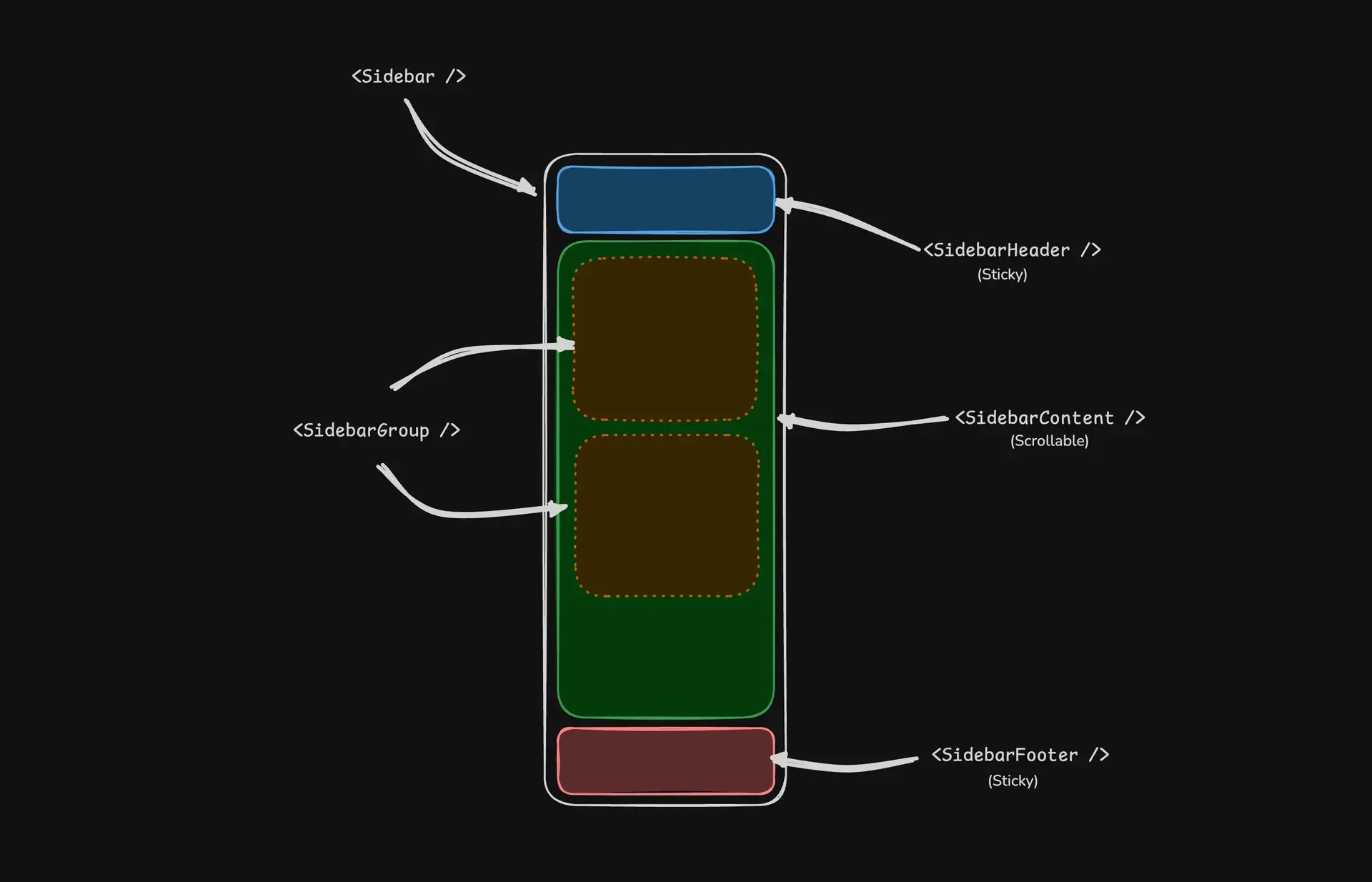
A Sidebar component is composed of the following parts:
SidebarProvider- Handles collapsible state and keyboard shortcutsSidebar- The sidebar containerSidebarHeaderandSidebarFooter- Sticky at the top and bottom of the sidebarSidebarContent- Scrollable content areaSidebarGroup- Section within theSidebarContentSidebarTrigger- Button to toggle the sidebar
Usage
Basic Layout
Wrap your application with SidebarProvider and place Sidebar alongside your main content:
---import {  Sidebar,  SidebarContent,  SidebarProvider,  SidebarTrigger,} from "@/components/starwind/sidebar";import { AppSidebar } from "@/components/app-sidebar";---
<SidebarProvider>  <AppSidebar />  <main>    <SidebarTrigger />    <slot />  </main></SidebarProvider>
Creating a Sidebar Component
---import {  Sidebar,  SidebarContent,  SidebarFooter,  SidebarGroup,  SidebarHeader,} from "@/components/starwind/sidebar";---
<Sidebar>  <SidebarHeader />  <SidebarContent>    <SidebarGroup />    <SidebarGroup />  </SidebarContent>  <SidebarFooter /></Sidebar>
With Menu Items
Use SidebarMenu, SidebarMenuItem, and SidebarMenuButton to create navigation menus:
---import CalendarIcon from "@tabler/icons/outline/calendar.svg";import CodeIcon from "@tabler/icons/outline/code.svg";import HomeIcon from "@tabler/icons/outline/home.svg";import InboxIcon from "@tabler/icons/outline/inbox.svg";import SearchIcon from "@tabler/icons/outline/search.svg";import SettingsIcon from "@tabler/icons/outline/settings.svg";
import {  Sidebar,  SidebarContent,  SidebarGroup,  SidebarGroupContent,  SidebarGroupLabel,  SidebarHeader,  SidebarMenu,  SidebarMenuButton,  SidebarMenuItem,  SidebarProvider,  SidebarTrigger,} from "@/components/starwind/sidebar";
const items = [  { title: "Home", url: "#", icon: HomeIcon },  { title: "Inbox", url: "#", icon: InboxIcon },  { title: "Calendar", url: "#", icon: CalendarIcon },  { title: "Search", url: "#", icon: SearchIcon },  { title: "Settings", url: "#", icon: SettingsIcon },];---
<SidebarProvider>  <Sidebar collapsible="icon">    <SidebarHeader>      <SidebarMenu>        <SidebarMenuItem>          <SidebarMenuButton size="lg">            <div              class="bg-sidebar-primary text-sidebar-primary-foreground flex aspect-square size-10 items-center justify-center rounded-lg"            >              <CodeIcon class="size-5" />            </div>            <div class="grid flex-1 text-left text-sm leading-tight">              <span class="truncate font-semibold">Starwind UI</span>              <span class="text-sidebar-foreground/70 truncate text-xs">Enterprise</span>            </div>          </SidebarMenuButton>        </SidebarMenuItem>      </SidebarMenu>    </SidebarHeader>
    <SidebarContent>      <SidebarGroup>        <SidebarGroupLabel>Application</SidebarGroupLabel>        <SidebarGroupContent>          <SidebarMenu>            {              items.map((item) => (                <SidebarMenuItem>                  <SidebarMenuButton href={item.url}>                    <item.icon />                    <span>{item.title}</span>                  </SidebarMenuButton>                </SidebarMenuItem>              ))            }          </SidebarMenu>        </SidebarGroupContent>      </SidebarGroup>    </SidebarContent>  </Sidebar>
  <main class="bg-background flex flex-1 flex-col">    <header class="flex h-12 shrink-0 items-center gap-2 border-b px-4">      <SidebarTrigger />      <span class="text-muted-foreground text-sm">Main Content</span>    </header>    <div class="flex-1 p-6">      <p class="text-muted-foreground text-sm">        Use <kbd class="bg-muted rounded px-1.5 py-0.5 text-xs font-medium">Ctrl+B</kbd> to toggle        the sidebar <br /> after clicking in this window.      </p>    </div>  </main></SidebarProvider>
With Inset Variant
When using the inset variant, wrap your main content in SidebarInset:
---import {  Sidebar,  SidebarInset,  SidebarProvider,} from "@/components/starwind/sidebar";---
<SidebarProvider>  <Sidebar variant="inset">    {/* Sidebar content */}  </Sidebar>  <SidebarInset>    <main>{/* Main content */}</main>  </SidebarInset></SidebarProvider>
API Reference
Styled Component API
These props are added or materially changed by the installed Astro styled component. Standard HTML attributes remain available through the inherited interfaces noted below. Follow the Primitive and Runtime links for lower-level behavior props.
Sidebar
Inherits div attributes.
Contains the following additional props:
persistenceKey string —
- Description
- Sets the storage key used for persisted state.
- Classification
- Primitive override
- Primitive prop
- sidebar.Provider.persistenceKey
persistenceStorage "localStorage" | "cookie" | false —
- Description
- Selects where persisted state is stored.
- Classification
- Primitive override
- Primitive prop
- sidebar.Provider.persistenceStorage
Sidebar
Inherits div attributes.
Contains the following additional props:
collapsible "offcanvas" | "icon" | "none" "offcanvas"
- Description
- Selects how the component can collapse.
- Classification
- Primitive override
- Primitive prop
- sidebar.Sidebar.collapsible
Sidebar Group Label
Inherits div attributes.
Contains the following additional props:
asChild boolean false
- Description
- Merges the component behavior and props into its child element.
- Classification
- Wrapper prop
Sidebar Menu Button
Inherits a attributes. Omits `type`.
Inherits button attributes.
Contains the following additional props:
boolean false
- Description
- Merges the component behavior and props into its child element.
- Classification
- Wrapper prop
boolean false
- Description
- Applies the active visual state.
- Classification
- Wrapper prop
"default" | "sm" | "lg" "default"
- Description
- Selects the component's visual size.
- Classification
- Styled variant
string —
- Description
- Provides collapsed-sidebar tooltip text for this menu button.
- Classification
- Wrapper prop
"default" | "outline" "default"
- Description
- Selects the component's visual variant.
- Classification
- Styled variant
Sidebar Menu Action
Inherits Button props.
Contains the following additional props:
boolean false
- Description
- Reveals the action when its containing item is hovered.
- Classification
- Wrapper prop
Sidebar Menu Skeleton
Inherits div attributes.
Contains the following additional props:
boolean false
- Description
- Shows the component's generated icon.
- Classification
- Wrapper prop
string —
- Description
- Sets the component width.
- Classification
- Wrapper prop
Sidebar Menu Sub Button
Inherits a attributes.
Contains the following additional props:
boolean false
- Description
- Applies the active visual state.
- Classification
- Wrapper prop
"sm" | "md" "md"
- Description
- Selects the component's visual size.
- Classification
- Styled variant
Primitive And Runtime API
Use these references when you need the lower-level behavior APIs behind Sidebar.
Primitive API
Runtime API
- Sidebar primitive
createSidebarControllerfrom@starwind-ui/runtime/sidebar
Changelog
v2.0.0
- Rebuilt Sidebar on Starwind Runtime for provider, collapsed, mobile, and control state.
- See the Sidebar Primitive for the underlying unstyled anatomy and behavior API.